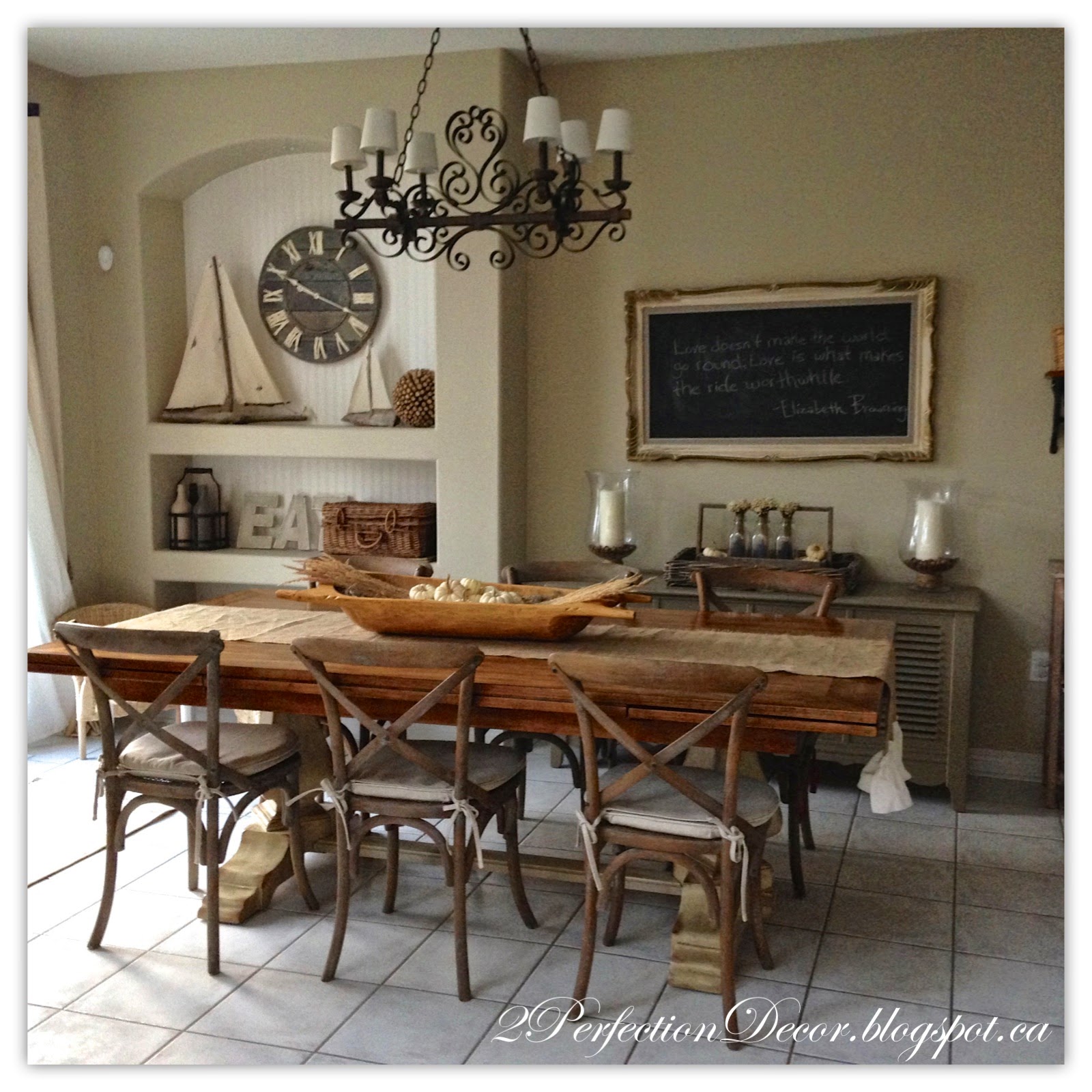
So here it is .. Our kitchen eating area.. I posted our kitchen reveal a few days ago.. If you missed it, you can see it here. Here is what some paint and new furniture and decorative accessories can do to a space.
Before the walls were darker and their was a lot of Black and Caramel tones going on.. I wanted to soften the look and create a more natural looking room. We already lightened the kitchen by painting the cabinets a nice light cream, BM Linen White. All the walls in Kitchen eating area and the adjoining kitchen were painted in a light neutral.. Benjamin Moore Natural Linen.. The doors were painted BM Cloud white.
Below is Our Kitchen Eating area this Summer. Bright and Fresh. It's a combination of more greens, whites and Shell's of course.
This is our Current Fall look. For a Centrepiece I used a Antique Dough Bowl filled with dried Moss, Dried Grass and lots of small white Pumpkins. See more of our Fall Home Tour here.
Our Kitchen Table is our previous home's dining table.. It's by Hooker Furniture. What's great about this table is it extends to 11ft if we ever need it to.. The chairs are from Restoration Hardware, I just love the X-back style.
Who doesn't love a good chalkboard??? In the kitchen above our vintage radio console we have an antique framed chalkboard. When we first viewed this house a year ago I knew it was my future chalkboard wall. This Chalkboard has been a focal point in many our homes in various locations. In our last home we had it in our Living Room. It's the perfect spot to display one of my favourite quotes. The menu chalkboard is a necessity .. Its my brain some days.. On Sundays I TRY!! And I mean Try...To talk out and write out a meal plan for the whole week.. Then Grocery shop on Monday's.. It doesn't always happen.. It's still a work in progress.. Sometimes it's just easier to pick up the phone and order in.. ;(
The Drywall niche was transformed with beadboard wall paper.. Gosh I love this stuff.. It looks real, and its easy to apply.. no real cutting required.. well some .. with scissors! See more Picture's here.

Here is our daughter's colouring station. It's a mix of a Striped Vintage table that already looked this adorable when I bought it from a Antique store and these cute mini Wicker chairs for kids from Ikea. I think it will be her eating area when she gets a bit bigger and has her cuzzie over ;) But for right now she knows it is where the markers and crayons stay.. All I can say is Thank goodness for those clear markers that can only draw on her magic colouring book!!
Across from the drywall niche display I have an open shelving area. White washed wooden shelves on metal corbels holds some white and creamy useable eye candy goodness. Below the wooden shelves I have a Dark Grey storage Cabinet with 12 drawers. To soften the whole look the Patio doors were painted white and I added subtle Striped Curtains with Rope tie backs on either side.
Below is our handy storage cabinet.. where I hide all my not so pretty stuff.. I don't have a desk in this kitchen. So all our mailing supplies, take out leaflets, extra pens and batteries etc now have a home. Come on we all have a place like this in our home.. Mine just happens to take up 6 baskets and 6 tiny drawers ;)
This is heaven! The kids love it!.. It's a Antique Paper Dispenser. We hung it to hold a kraft paper roll.. It's great for a long piece of paper for my daughter to go nuts on.. It's like the Jack Astor's restaurant in your own home! I used the wood top to hold a woven basket from Homesense. The basket stores our daughter's extra bibs and crayons.. I'm a mom so I need practical but I want it to look nice too.
Thanks for looking.. Hope you enjoyed! You can see the rest of our Kitchen Reveals here


Such a beautiful room! I love everything in it!!
ReplyDeleteThank you so much Lisa! We are really happy with how everything turned out.
ReplyDelete