Here is a more in depth look at the drywall built-in Media Niche.. Our Family room under went quite the makeover. We painted the dated built-in media unit BM Cloud White.. I know white sounds like it would stand out more.. But it actually looks wayyy better painted white! To make the mantel more of a focal point I added this white mantel above the fireplace. It was just that missing little detail! Once we installed it I couldn't wait to decorate it for the holidays. Originally I thought we were going to have to paint the walls as they seemed to a little dark for my taste... BUT once we painted the wall unit, removed all the wood blinds and added our striped area rug with our white sectional.. Everything changed.. Finally our room seemed brighter, fresher and more 'US'!
We also painted out the gold metal on the fireplace with High Heat Matte Black Fireplace/BBQ Paint.
The right side of the unit used to be one large plain mirror.. Pretty but pointless?? So we added shelving to make it functional!! Now it can hold all my lovely eye candy.
Leaned against the shelving is my vintage ladder
The shelves kind of have a subtle nautical theme going on.. its a mix of Vintage books, wooden accents, and shells. I picked up this cool vintage wooden drawer at an antique market a few years ago.. It adds some vintage character to our new shelves.
We added Beadboard wallpaper as the back drop to each of the drywall cut-outs to lend to our French country vibe. See how our Kitchen Built-ins turned out HERE.
This is our Spring/ Summer Mantel Display.. I kept it simple with greenery in small galvanized tin pots which tied into the chrome studding around the mirror.

A Sailboat, Coral and Rope.. It can't get any more Nautical than that! Well maybe an anchor ;)
I found these fabulous woven baskets that fit the boxes perfectly!!! They hold our daughters puzzles and her DVDs..
We styled the upper part of the Media unit.. it was open to above.. so of course I had to decorate it! It's all neutral decor so that way it doesn't need to be changed up seasonally.. It's too hard, climbing and lugging items up a ladder!! Or at least thats what my hubby told me.. You should of seen my fabulous hubby displaying stuff for me, I'd pass things up to him, he would be struggling on the ladder, I would take steps back then say 'more to the left, a little more, ok back a touch to the right.' He was pretty good about it, but by the end of it I think he hated me!
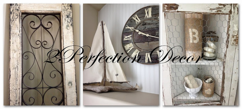
We used our antique window frame from our wedding table chart, wooden boxes that I painted in BM Alexandria Beige, Shutter from Homesense (that was red but only $19 so I decided the price was right I would just paint it!) With a really cool clock that was a house warming gift from my in-laws.
Didn't he do a great job??? :)
If you missed our FULL FAMILY ROOM REVEAL Click HERE
Shared with:
Thoughts from Alice - Sundays at Home
Coastal Charm - Show & Tell No.238
Thrifty Decor Chick - December Before & After


No comments:
Post a Comment